彼得罗夫广告设计 Peter Thomas Roth Ad Design
同朱砚合作完成/In collaboration with Yan Zhu2013年秋,中国北京/Fall 2013; Beijing, China
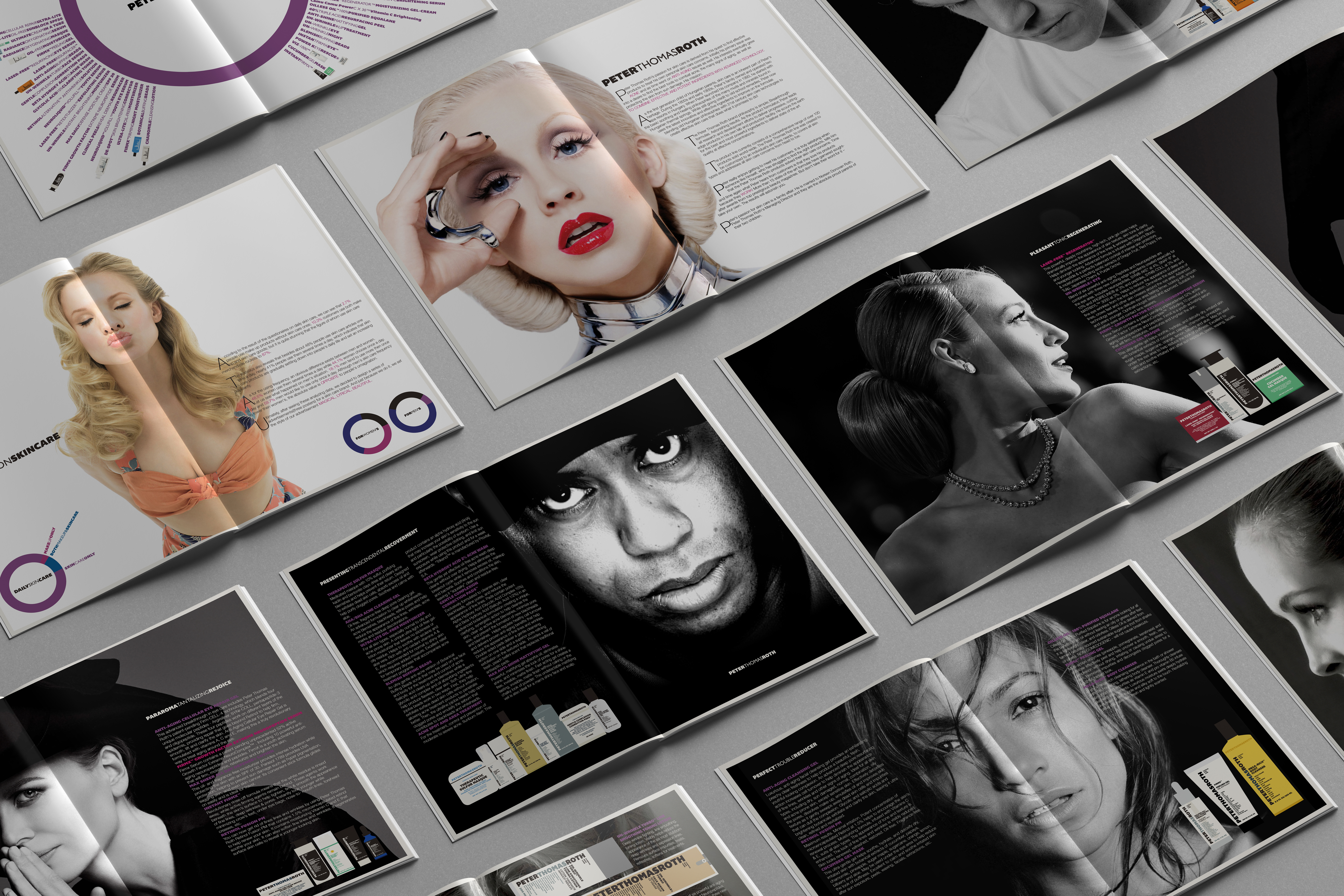
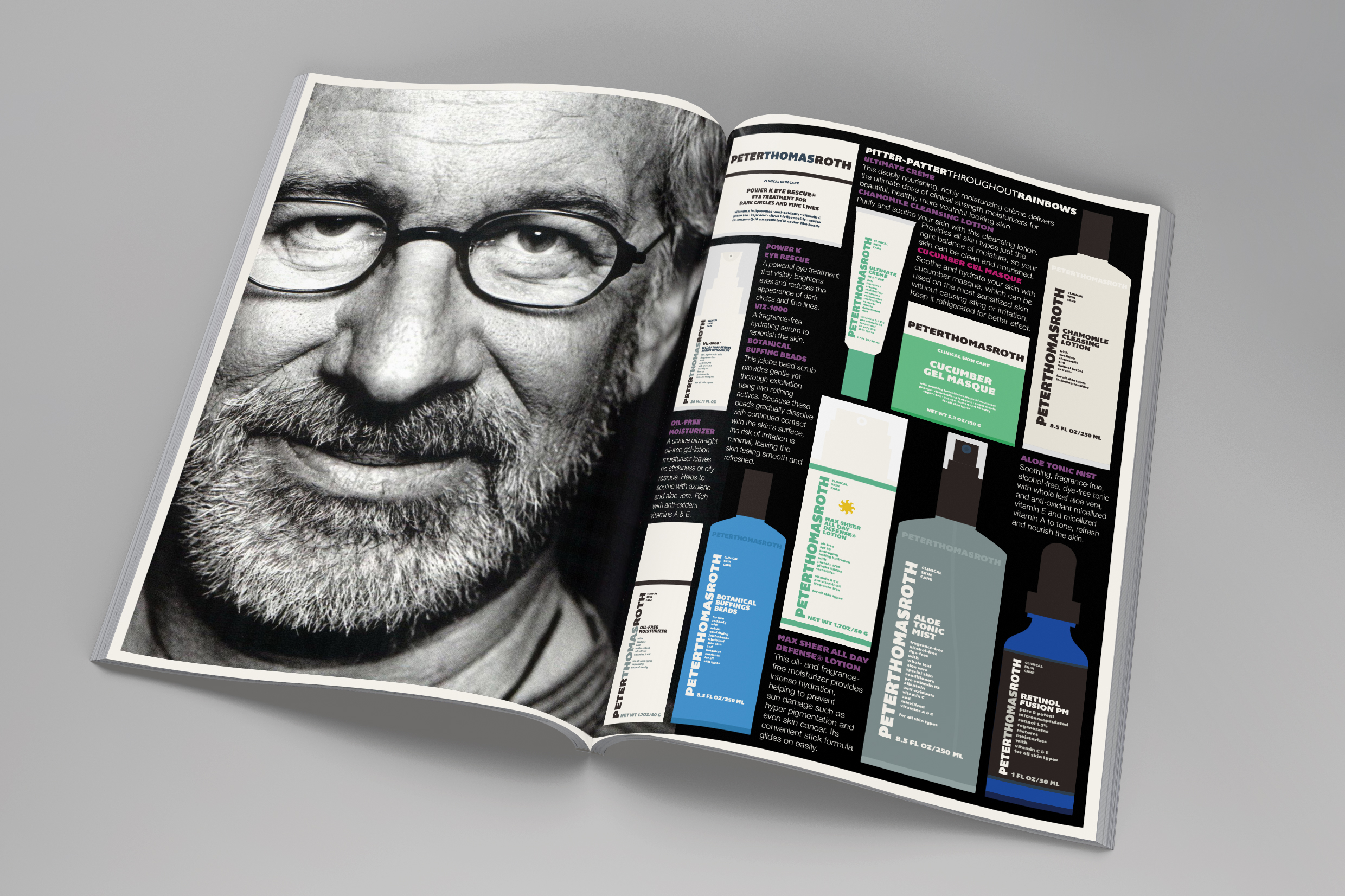
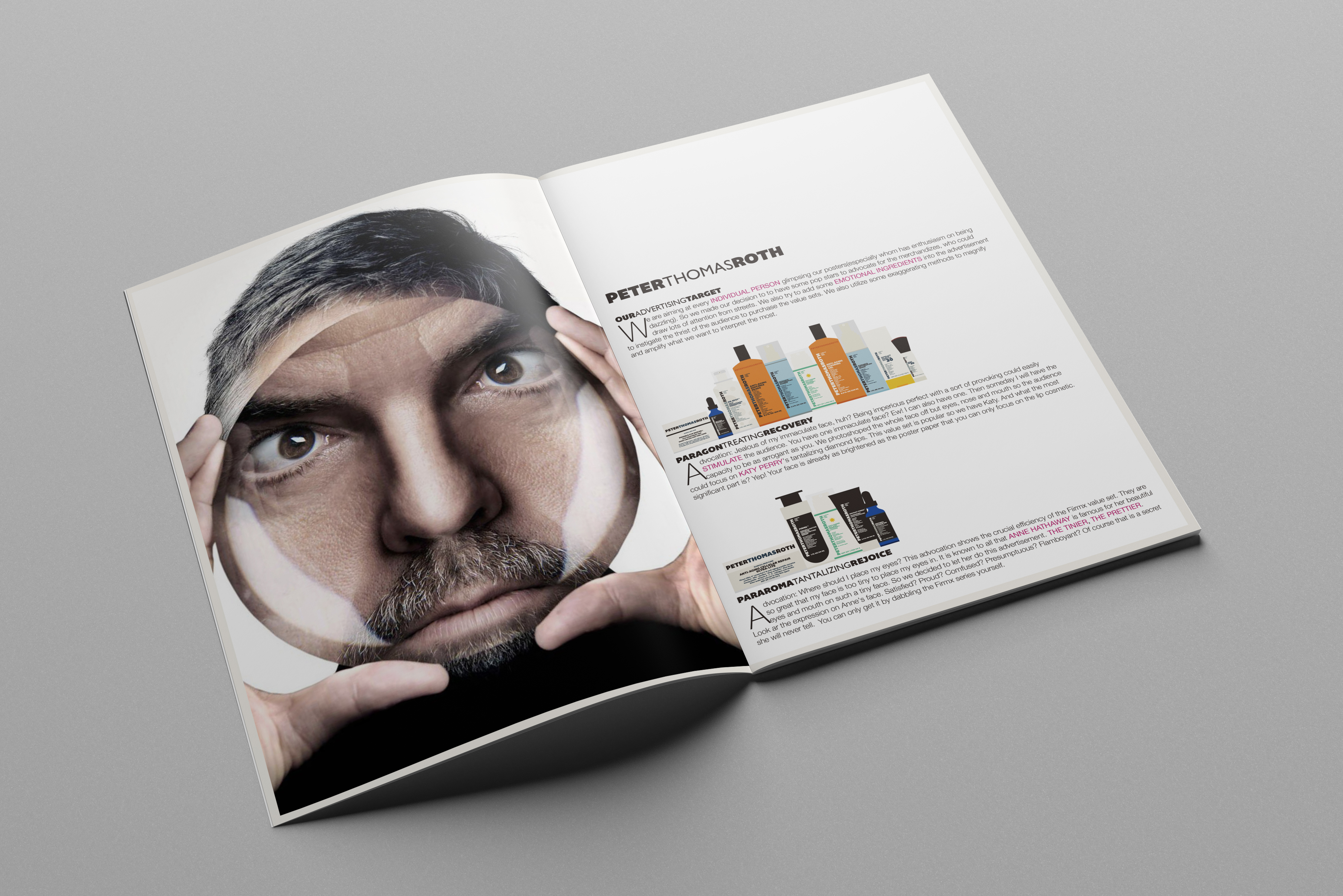
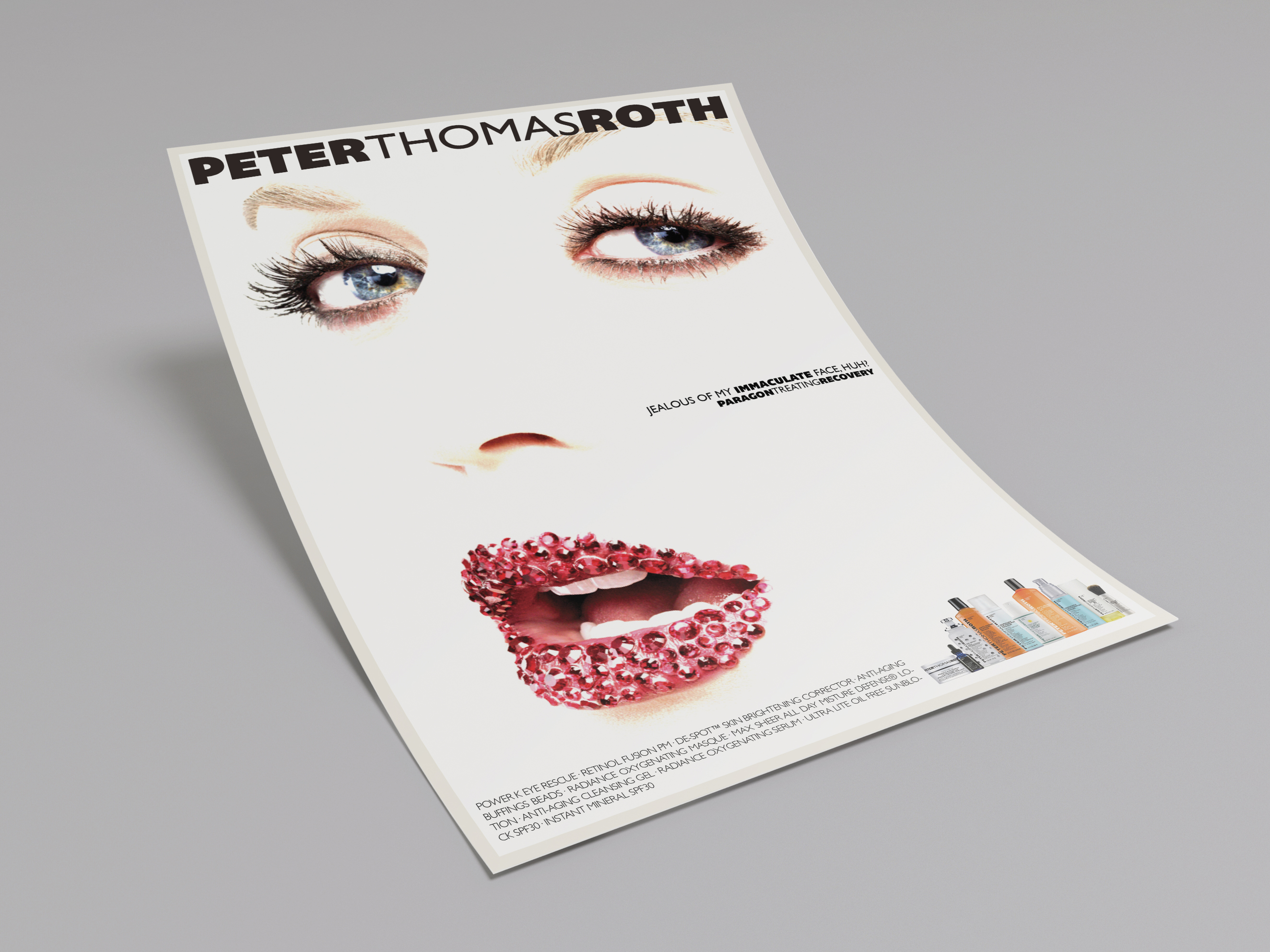
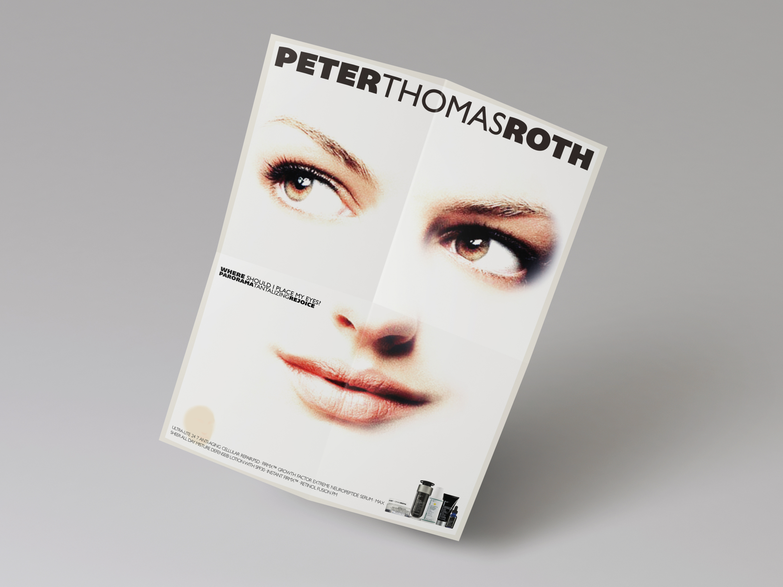
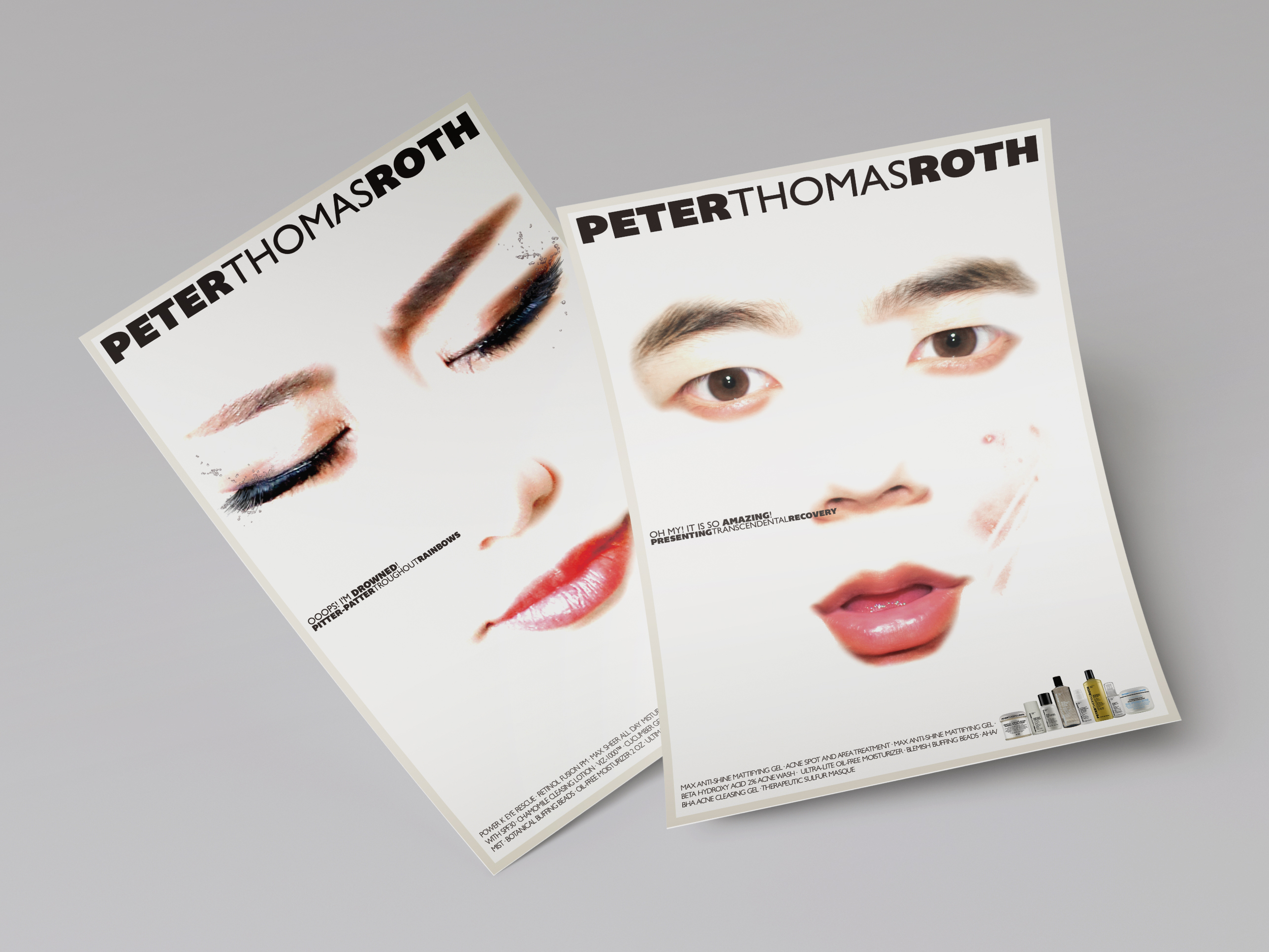
在对护肤品牌 “彼得罗夫” 进行了相关分析后,该品牌的主要性格始终被贯彻于头脑风暴及整个设计流程,例如所有广告语均由三个字母组成且首字母为粗体-细体-粗体的 “PTR” 三个字母。设计均为平面印刷媒介。
After analysing the skin care brand “Peter Thomas Roth,” its main character was being applied during the brainstorming and the whole design process of the advertisement design, such as all the subtitles are in three words whose initials are “PTR”in bold-light-bold pattern. Flat printed matters only.
本人不享有项目封面图的版权。该图仅用于课程项目训练与作业,不涉及任何商用目的。如涉及版权纠纷,请联系设计师本人。相关内容会立即做删除处理。
Li Han does not own the image in the thumbnail. It is only used for educational project training and exercising instead of any commecial purpose. If there is any copyright concern, please contact the designer and the related content will be obliterated immediately.
#广告设计/advertisement design
#商业广告/commercial advertisement
#宣传册设计/brochure
#海报设计/poster
#版式设计/typography
#插画设计/illustration